Background
About ChickPT
ChickPT is the largest part-time job platform in Taiwan, allowing employers to find excellent part-time workers and providing job seekers with various opportunities to earn and save money.
Project Goal
Originally, job searching was limited to location filtering and results were displayed in a list, making it impossible to intuitively see the relative positions of part-time job locations.
Persona
Students
Looking for part-time jobs during their free time, preferring jobs near their school
Looking for temporary jobs
Already have a full-time job and looking for part-time opportunities near their home
Design Process
1
Information Architecture, Function Planning
Competitive Analysis
Planning Flow and Features
Confirming Feature Content
2
Design Delivery, Technical Collaboration
Creating Hi-Fi Design
Discussing specifications and implementation limitations with the pm and engineers
Delivering Hi-Fi Design
3
Testing
UI and UX Testing
Feature Planning
Competitive Analysis and Initial Planning
First, I conducted a competitive analysis, focusing on the design of the map's interaction methods and information presentation.
Subsequently, I communicated these suggestions with the PM to determine which features meet user needs, and to discuss the best design and implementation methods.

Image: Competitive Analysis


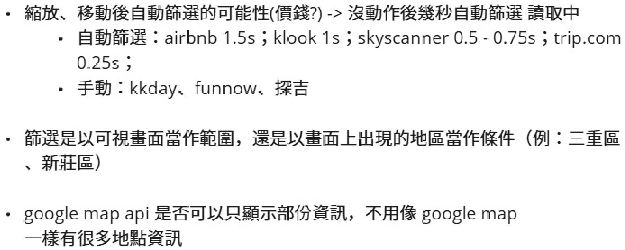

Image: Initial Planning Content
Fixed Zoom Level
Display the top 15 part-time jobs within the range determined by the center point of the screen and the zoom level

Advantage
User experience is more consistent
Lower development difficulty
Disadvantage
The screening scope may be less than 15 jobs
Dynamic Zoom Level
Adjust the map zoom level based on the top 15 part-time jobs in the filtering results, so that all jobs are displayed on the screen
Advantage
Most filtering conditions can display 15 part-time jobs
Disadvantage
Zoom level changes drastically, which can easily cause confusion in operation
Finally Selected Fixed Zoom Level
Because map operations are very flexible and require handling many scenarios and exceptions, such as whether to turn on location services and whether to filter by region, this would make development more complex. Therefore, reducing development difficulty was our primary consideration. Although the fixed zoom level may display fewer part-time jobs, we can quickly solve this problem by using simple prompt text to allow users to adjust the filtering conditions or move the map.
Goals
Easy to operate
Design user-friendly interaction methods, allowing quick browsing and viewing of job details
Clear information presentation
Clearly mark locations, quickly display key information such as salary and working hours, avoiding information overload
Real-time filtering
Complete filtering functions to help users quickly find jobs that meet their needs
Quick response
Results should be presented quickly to ensure smooth usage
Design
Goal: Clear information presentation
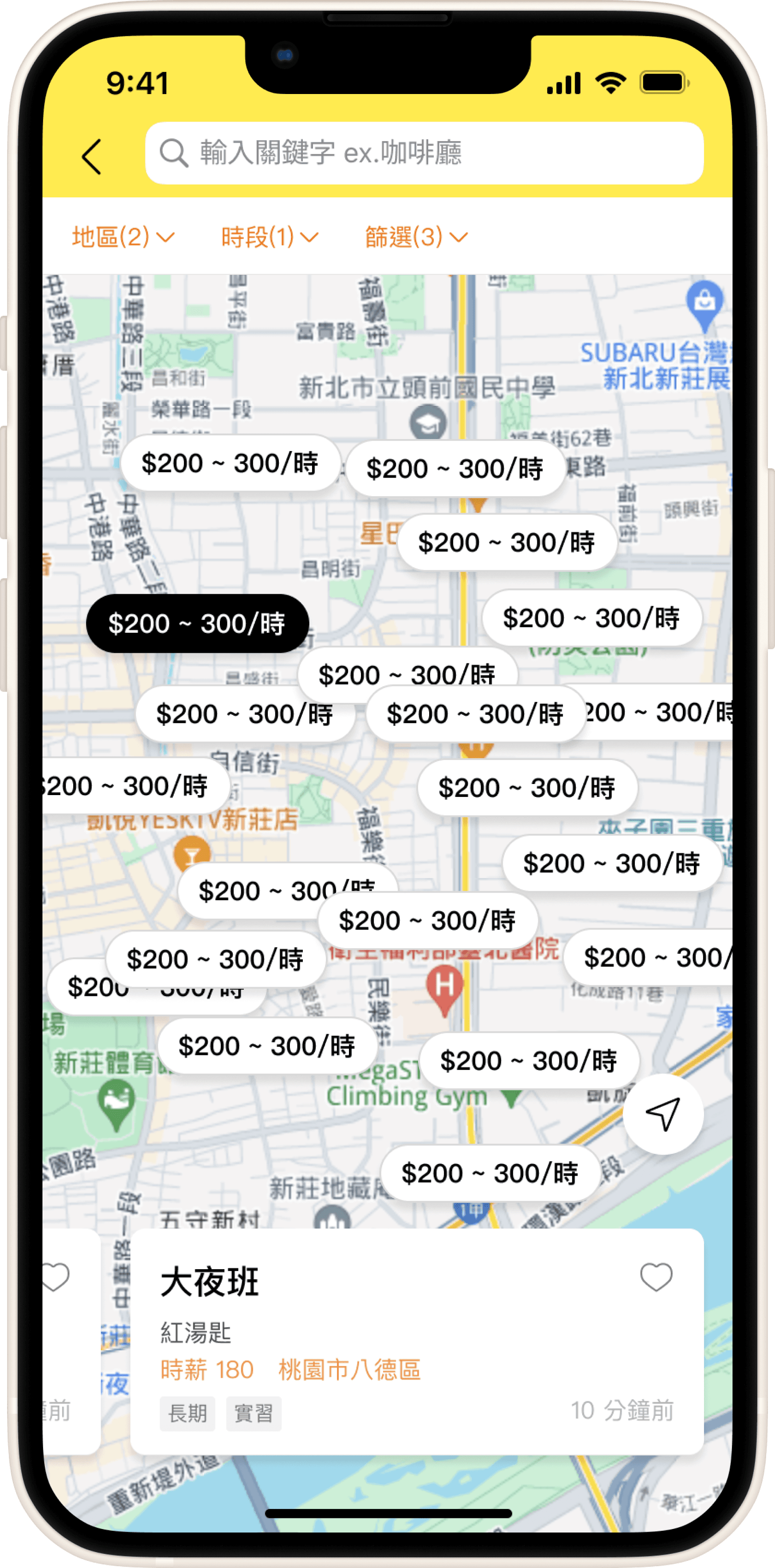
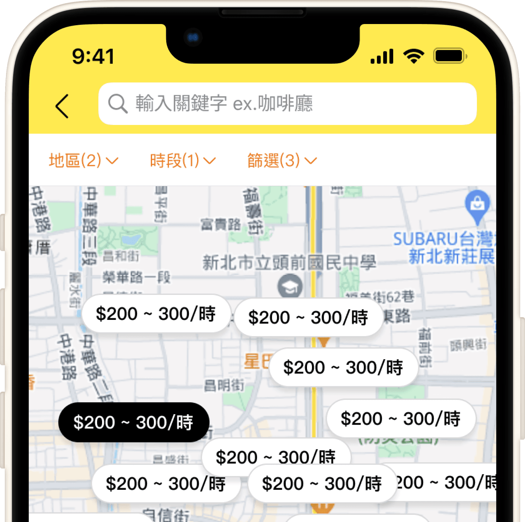
The part-time job labels on the map are divided into 2 modes to provide the best information at different zoom ranges.
Large map range: Labels only display the city/county name and the number of part-time jobs in that area, allowing users to quickly understand the distribution of jobs.
Small map range: Labels display the hourly wage of each job, which is also the most important information for job seekers.
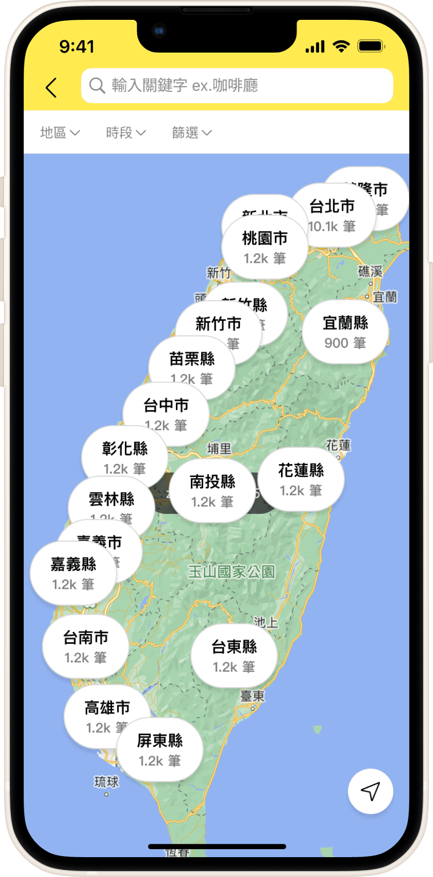
Image: Map Part-time Job Labels

Image: Map Part-time Job Labels
After clicking a label, users can view a detailed information card, including the job title, feature description, and distance from the MRT station, helping users quickly understand suitable job opportunities.

Image: Map Zoom Result Display
Goal: Real-time filtering
The map uses the same filtering conditions as the list: location, time period, salary, etc., allowing job seekers to view filtering results in different ways according to their needs.
Image: Part-time job list
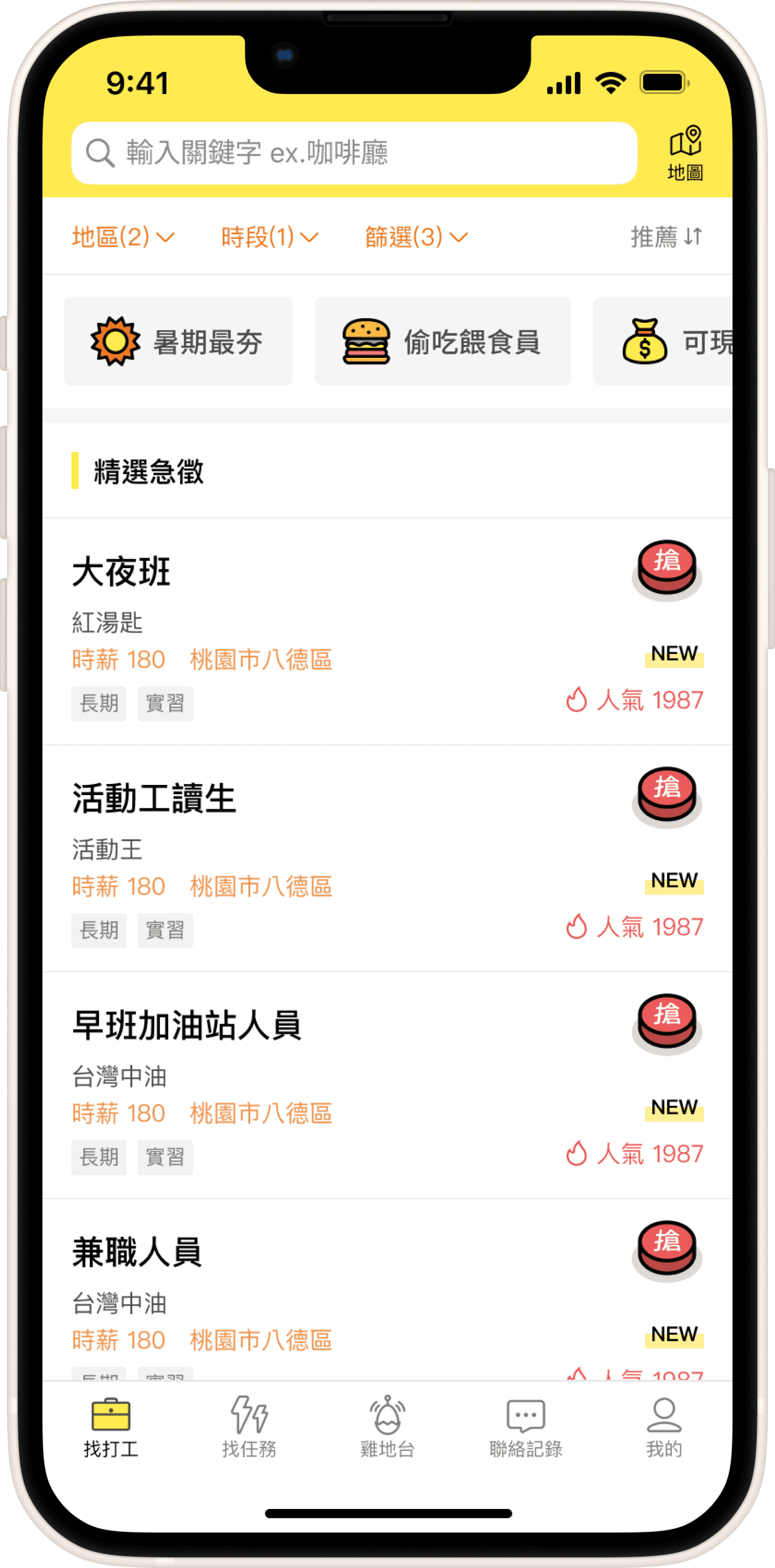
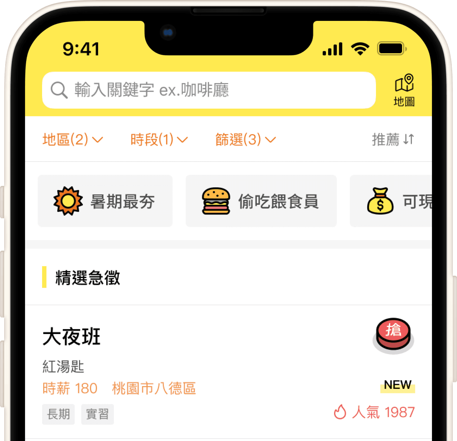
Image: Part-time job map
Goal: Quick Response
When designing the map function, we emphasized the real-time refresh of filtering results after zooming and moving the map and ensured that the response speed was fast enough to avoid delays affecting the user experience.
If no jobs matching the filtering conditions are found, a prompt message will be displayed in real-time explaining that there are no results and reminding users to adjust the filtering conditions or map range to find jobs that meet their needs, avoiding confusion due to inconvenient operation.

Image: Map card interaction
Image: Map empty state prompt
Learning Reflections
During the design process, I realized that the design of the map function is not only a visual presentation but also requires a comprehensive consideration of user behavior and needs.
During the collaboration with the engineering team, I found that sometimes design solutions require the technical support of other teams, which made me appreciate the importance of teamwork even more. Through the small tool developed with the help of engineers, we can more effectively test design assumptions and quickly verify them during the planning stage, thereby shortening decision-making time and improving work efficiency. Such collaboration not only strengthened the feasibility of the design but also ensured that subsequent development could proceed smoothly.