Results
Background
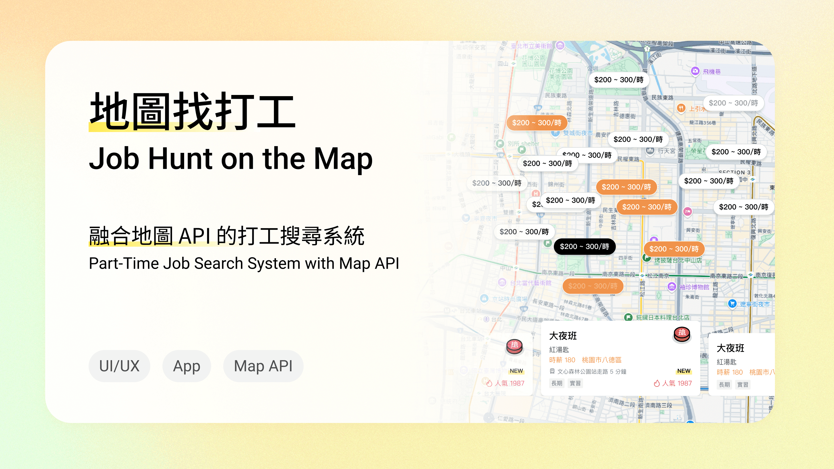
About ChickPT
ChickPT is the largest part-time job platform in Taiwan, allowing employers to find excellent part-time talent and providing job seekers with various opportunities to earn and save money.
Project Goal
The quality of job seekers has always been a concern for employers, but a single function cannot completely solve this problem. Therefore, the purpose of the test is to and to let, further enhancing employer trust and goodwill towards the product.
Persona
Young people aged 18-24
The largest group of job seekers, and the age group with less experience
Design Process
1
Feature Planning
Plan the flow, features
Confirm feature content
Set the style
2
Design Delivery
Create Hi-Fi designs
Create animations
Create prototypes
Deliver Hi-Fi designs
3
Testing & Optimization
UI and UX testing
Optimization and adjustments
Feature Planning
In this phase, I first : focusing on job seeker-related features. Then, I , including the basic flow of "Entry → Quiz Content → Quiz Results → Resume Preview," and for each step, such as required information, functional needs, and possible exceptions to ensure the comprehensiveness of the flow. In addition, I also to facilitate intuitive discussions and adjustments with the marketing and PM teams, thereby promoting efficient cross-departmental communication.

Image: Initial Planning Content
Goals
Maintain Fun
An overly serious style may lead to a lack of user willingness to take the quiz
Reduce Bounce Rate
Ensure the process does not make users feel tired, thereby increasing the completion rate
Design
Flow Design
There are 2 types of answering processes: question-by-question analysis and providing all analysis at the end. The following is a comparison of the two
Question-by-Question Analysis

Advantage
The answer is known immediately after each question is answered, allowing for immediate correction of errors and better learning
Disadvantage
More clicks, increasing bounce rate
Provide All Analysis at the End
Advantage
All answers are known only after all questions are answered, providing better quiz flow
Disadvantage
Large amount of analysis text, reducing willingness to read
Key Decision Point: Based on the purpose of the quiz
The core purpose of the project is to educate job seekers to develop the correct job-seeking attitude, so we chose the question-by-question analysis method, which can immediately help job seekers understand and correct errors.
And the questions are basic common knowledge, with low difficulty, so there is no need to repeatedly show error analysis after the test.

Image: Step-by-Step Analysis Flow
Mitigating the Risk of Increased Bounce Rate: Enhancing Interaction Experience.
Although question-by-question analysis can effectively promote learning, too many clicks will increase the bounce rate. So we decided to , making the learning process richer and keeping job seekers focused, avoiding loss caused by overly cumbersome operations.
Interaction Design
Initial Design Observations and Recommendations
The marketing team initially designed multiple-choice questions and wanted to use left-right swipe card interaction (like Tinder), but I found that swipe cards are not suitable for this type of multiple-choice question, so I suggested changing to true/false questions to better fit the interaction needs.
Design Hints and Operation Assistance
I referred to the operation modes of other products and designed hint arrows and animations to help users understand the operation. Although the team thought the design was clear enough, after development was completed, I still felt uneasy and asked colleagues from non-product departments to try it out. The result was that the hints were still not clear enough, and they were still confused about the operation.
Image: Instructional Arrows
Problem Solving and Test Optimization
To quickly solve this problem, I actively discussed with the engineering team and jointly decided to add overlay instructions and animation assistance. The second usability test proved that this adjustment was effective. This experience also made me realize the importance of using prototypes for testing in advance.

Image: Cover description and animation
Image: Swipe Interaction Example
Transition and Animation Design
Design Intent and Goals
To make the quiz experience smoother and more immersive, the transition effects chose fade in/out and slower speeds, creating a calm and focused atmosphere and avoiding being too eye-catching and interfering with answering.
Production Challenges and Subsequent Adjustments
The correct/incorrect feedback and badge acquisition animations were made using After Effects and then converted to Lottie files for engineers to use. During the process, some effects could not be rendered through Lottie, and I spent a lot of time finding information and adjusting to supported effects.
This experience also reminded me that when designing animations in the future, I should or consider using, such as Phase.
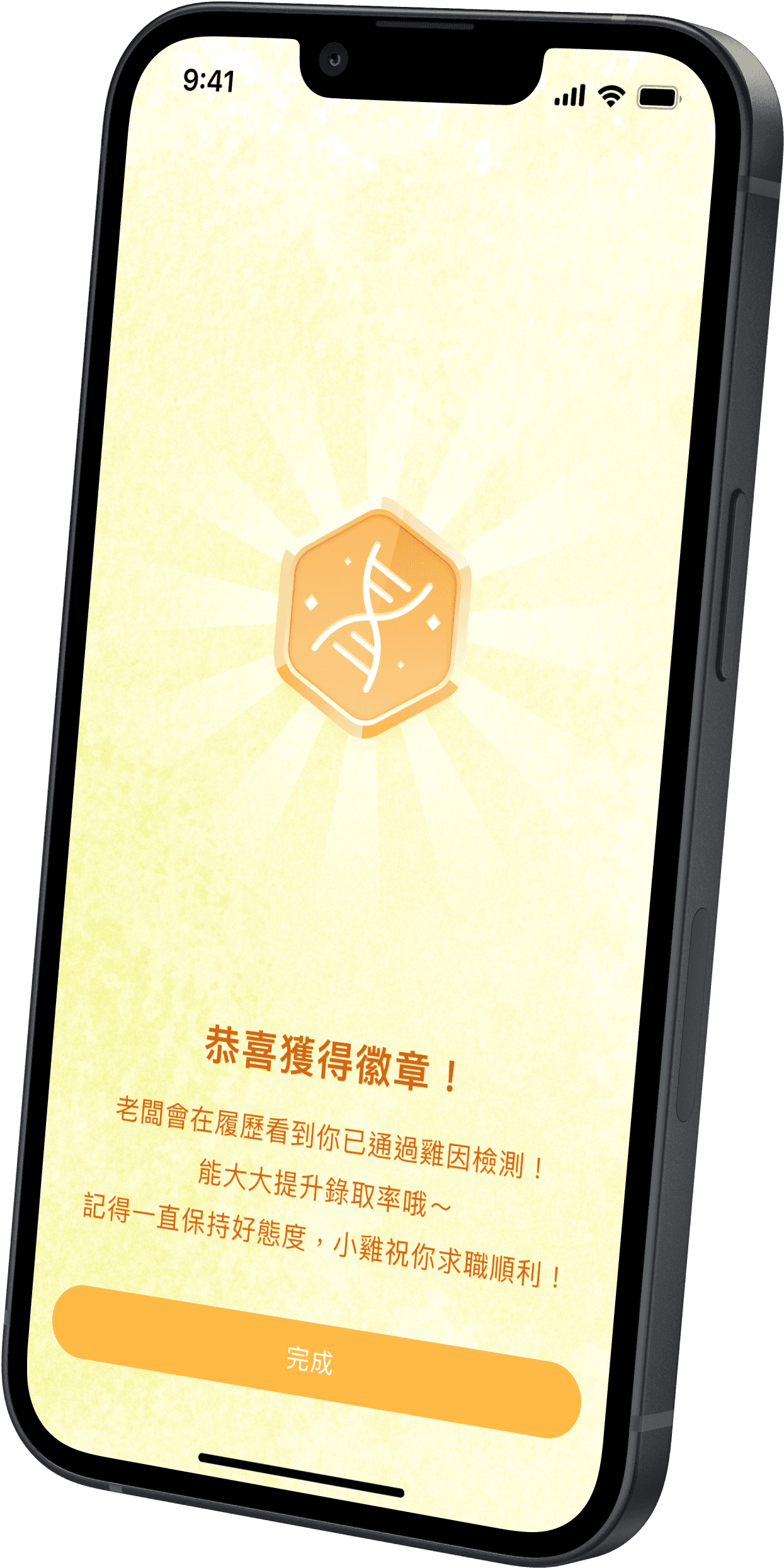
Image: Badge Award Animation
Image: Correct and Incorrect Feedback Animations
Vibration Design
Design Intent and Goals
This project introduced haptic design for the first time, using vibration feedback to , enriching the user's interactive experience. I was responsible for researching the vibration designs of other products, while the engineers simultaneously evaluated the feasibility of implementation.
Finally, I compiled the vibration timing, trigger events, and patterns of different systems into a table for engineers to refer to.
Testing Adjustments and Optimizations
During testing, it was found that the vibration of "click to submit" and "answer appears" in multiple-choice questions was too frequent, making it easy for users to confuse correct and incorrect feedback.
Therefore, the vibration of "click to submit" was finally removed, and only the feedback of "answer appears" was retained, enhancing the clarity of the design intention.

Image: Vibration Feedback Specifications
Collaboration With Engineers
Because there are many transition and animation details in the project, in addition to basic component notes, I also created a Prototype to show the transition effects during the operation process, and marked the transition time and animation attributes on the flow chart, so that the engineering team could have a clearer understanding of the overall design.
Image: Transition Animation Prototype

Learning Reflections
When a product has been running for a while, updates are usually done following the old design methods. But this can easily make the design fixed, lacking innovation and challenge. Therefore, I will remind myself to dare to try different design methods while maintaining the consistency of the product style, find solutions that are more in line with user needs, and improve the overall experience.
At the same time, we must also remain flexible, quickly find the best solutions with the team according to the current situation, and ensure that the design can flexibly respond to various challenges.